
Moving on, with Skills, Insight and Power
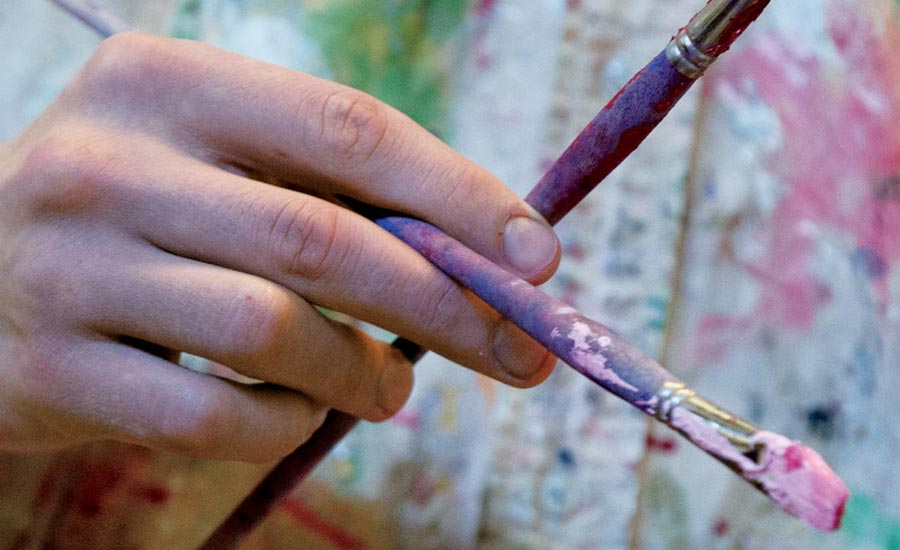
Milton Artists Speak Their Minds
Some student artists come to Milton hungry to try various media, already tech savvy, aware of the power of design. Perhaps they started tinkering in an elementary after-school art class or got a Flip video camera (now-defunct) as a birthday gift, and kept experimenting. Other teens wake up to an exciting experience in the arts for the first time through one of Milton’s foundational arts program courses, and simply dive in. Ultimately, a number of boys and girls grow toward the particular challenge and reward in the arts. Today, their skills and expectations are likely to be integrative: They easily build on classical principles with advanced design, technology, and materials, and can count on myriad roles in today’s cultural and economic marketplace. At Milton Magazine’s invitation, five seniors selected works of importance to them, and we share those, along with statements about their intent, the technical issues they man- aged and insightful perspectives on their own creative processes.
 Joy Lee ’17
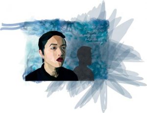 I question what’s around me in day-to-day life, what I have yet to see and to understand. I’m drawn to narratives in my external environment—used materials, untold stories of cultures and people. I present these ideas and details both conceptually and viscerally. Spontaneous and physically connected to my work, I can as easily cover a note- book with calligraphy as shape an architectural form study with mesh window screening and wire. For this self-portrait, I photographed myself with my camera set atop a stack of books, fiddling with the neck of my small LED study lamp and the shadows it created. Outside the classroom, I began a journey in publication design that carried through to industrial design. Now, I’ve learned that social impact design is the intersection between my desire to help people and my passion for sustainable design. While my journey has only begun, I want to assist communities facing challenges through delivering good design and creative approaches. I dream of being on an international frontline, researching social and health issues, and designing creative solutions that will affect populations and help them to be independently sustainable.
 Matt Magann ’17
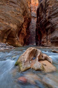 Photography, more than most media, is intrin- sically tied to the visible world. A photograph is a literal depiction of something that exists, yet the photographer’s interpretation of that reality is what makes a photograph art. In my work, I like to explore that dynamic. I don’t pretend that my photos are an objective doc- umentation; they hinge on my own experience of the scene. Yet of course they also depict something that physically exists. A photograph is a kind of collaboration between the scene and the photographer: The final product is a synthesis of vision and reality. Photography highlights, celebrates and challenges the ways in which we perceive the world.
Each of these images that are among my favorites depicts a location I found moving. In these photographs, I haven’t tried to minimize the subject. By acknowledging the nature of the image, I let my vision work with the scene to create a final photograph.
 Sam Oldshue ’17
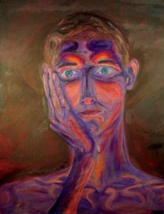 My style can be described as between classic and modern, creating form out of a combination of line and value. Influenced by Impressionists such as Degas, Cassatt, Sargent and Van Gogh, as well as more contemporary artists such as Freud, my expressive strokes of intense color and unbalanced composition give each work a distinct psychological mood. Between graphic and tonal, the work, whether painted or drawn, focuses on intense minute details that come together to create form. This attention to detail some- times distracts from overall form, but when balanced, it draws the focus of the viewer to the areas of the work that most clearly express the subject. Oil paints have become my preferred medium because they challenge me to be both technically sure and expressive, to escape the confines of form. I try to find a tension between photo realism and realistic abstraction. I spent years teaching myself to capture a subject, to observe and copy it onto a page. Since I started painting seriously, I have been figuring out how to balance reality with interpretation, struggling to paint both a person’s jaw line and his personality. Working from life and photographs of my own com- position, I try to let my emotions and my model’s life experience influence how I express them. Art allows me to show an interpreta- tion, both physical and emotional, of a moment, person, or a situation that is deeply personal. I want my audience to be able to feel that connection.
 Te Palandjian ’17
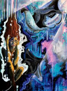 “Too Deep” is the second piece in my “Network of Dreams” multi-media painting series. The series depicts girls in surrealistic nature landscapes, Edens that I have explored in my own dreams. The first in my series depicts a girl cannonballing into an ocean of pink jellyfish, only to learn that trees and the White Mountains are beneath the surface. “Too Deep” follows that narrative, depicting what the girl encounters as she sinks into the depths of the ocean. Though she is fearful about the darkness and pressure against her ears, a paradise awaits her—an underwater galaxy of stars, playful manta rays, and streams of light from above. Each time I look at “Too Deep,” I feel the fear, excitement and appreciation for nature that I experienced in my dreams.
From a stylistic standpoint, “Too Deep” characterizes my work. I like to use bright colors (blues and pinks here), gestural and visible brush strokes, and moving forms. I used colored India ink, acrylic paint and spray paint for the streams of light. I am proud of the chaotic lawlessness of my lines, colors and media. These techniques represent not only my messy passion in the studio, but also my natural approach to life.
 Evan Scales ’17
 Having worked for a number of years off campus in video and marketing, I approach my photography with a large emphasis on viewer engagement and entertainment. In many photography classes the phrase “because it looks cool” would be frowned upon as a rationale, but I believe that if you can describe your work using that phrase, you’re doing something right. Before a viewer even reads your text copy, he or she is going to judge the visual appeal of the ad. If the image doesn’t draw them in, they’ll never read your call to action. This is not to say that my photography is just meant to look “cool”; I also strive to move the viewer with emotion and a message. I hope you enjoy!